Twelve Books Rebrand
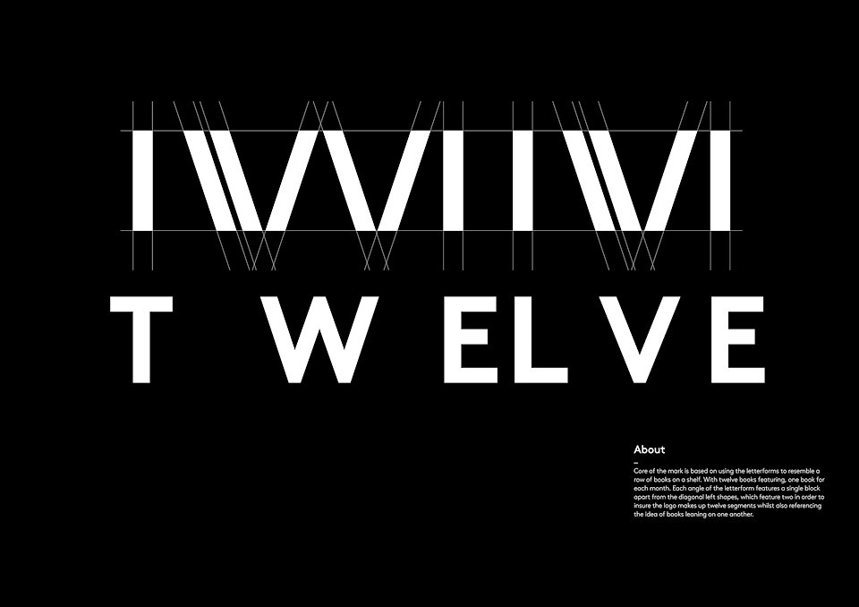
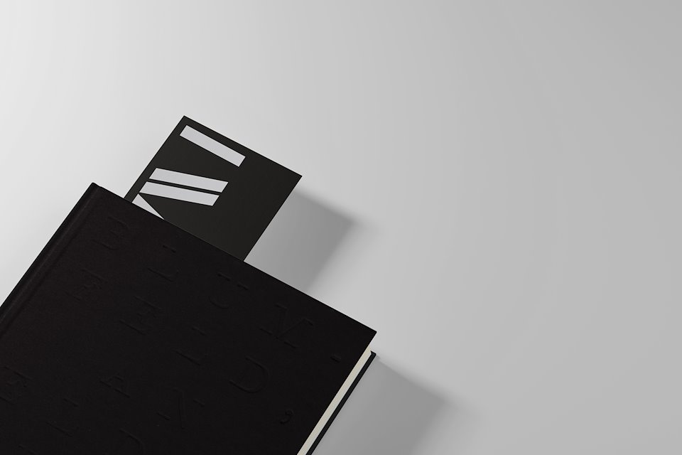
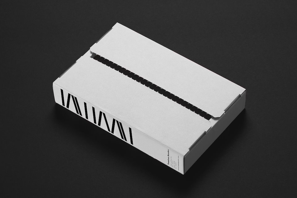
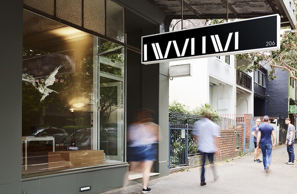
The core of the mark is based on using the letterforms to resemble a row of books on a shelf. With twelve books featuring, one book for each month. Each angle of the letterform features a single block apart from the diagonal left shapes, which feature two in order to insure the logo makes up twelve segments whilst also referencing the idea of books leaning on one another.
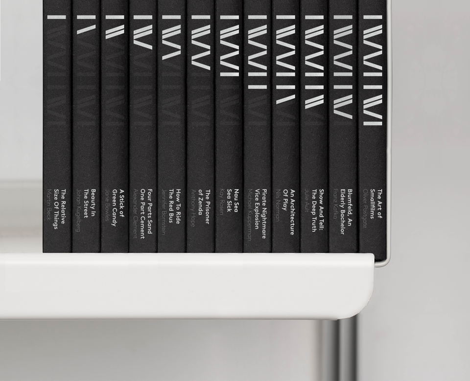
When the marks applied to the spine of a book, the mark is only fully exposed once all twelve books sit next to one another on the shelf.
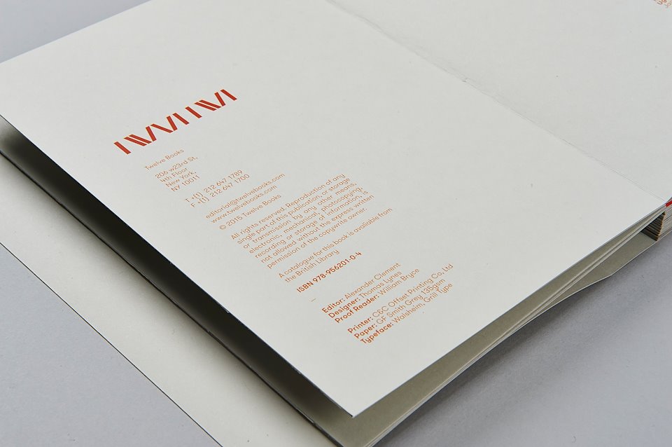
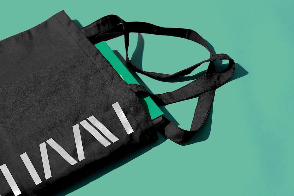
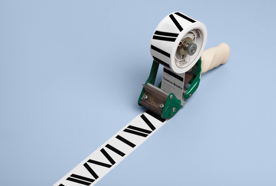
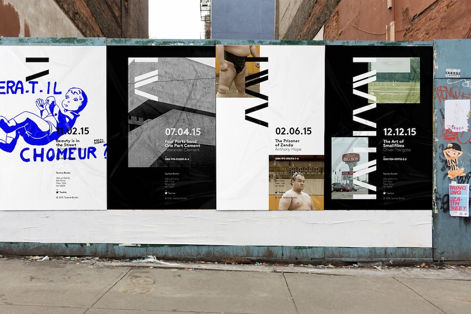
Visual Identity
/background(fff)/960x540.jpeg?auto=webp)