Four / One BLAD Design
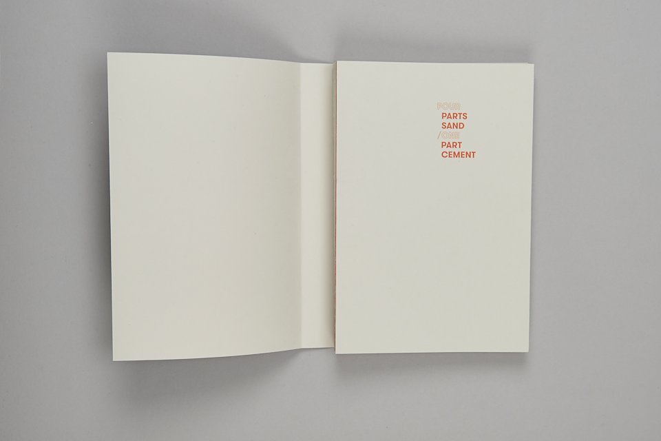
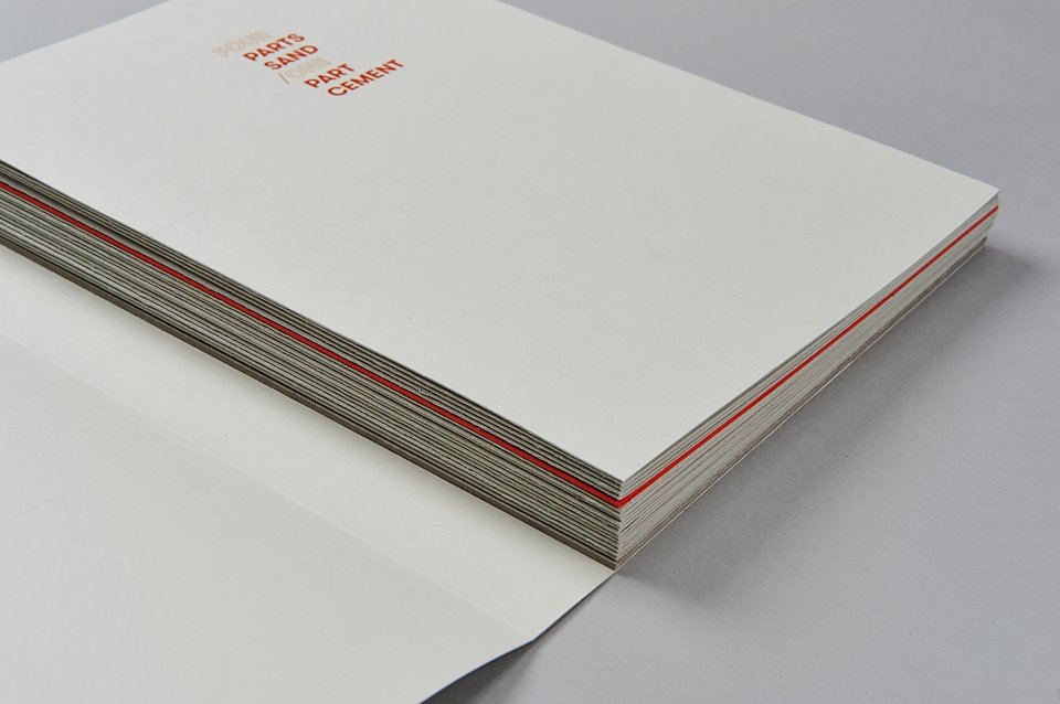
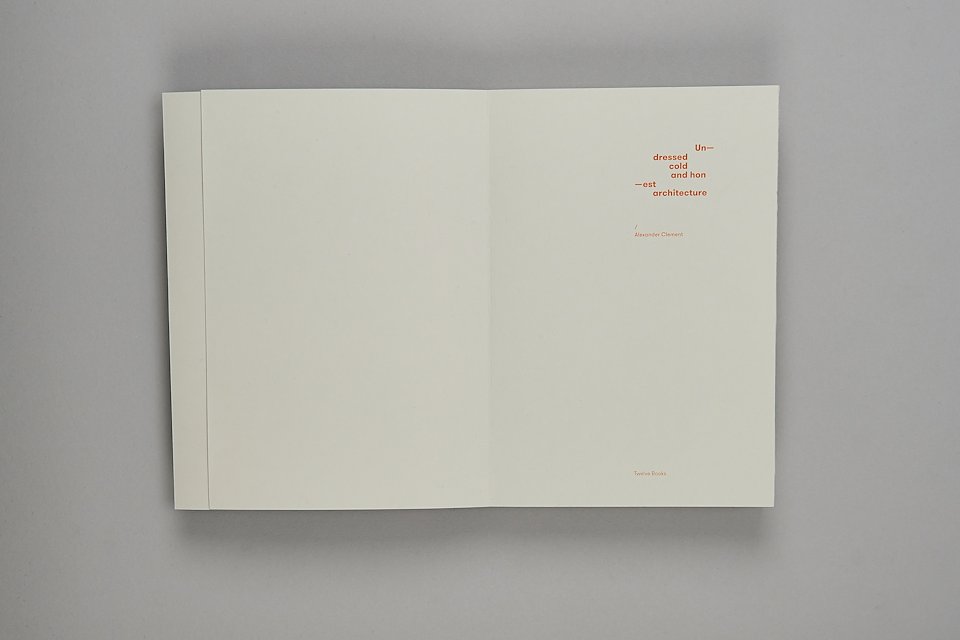
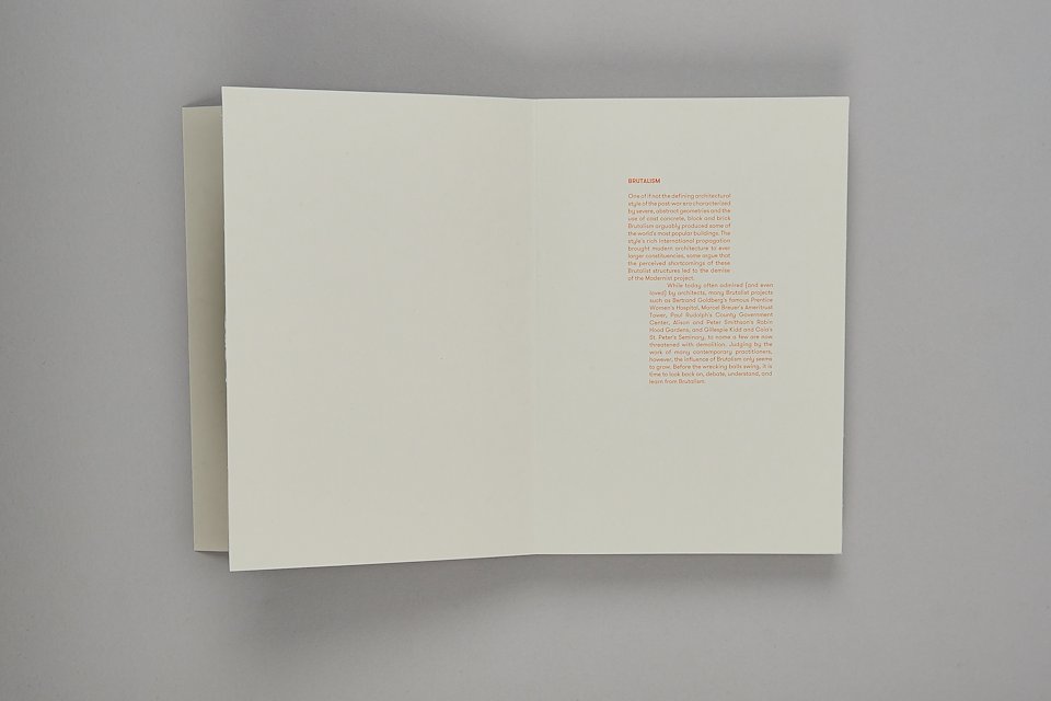
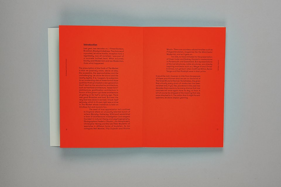
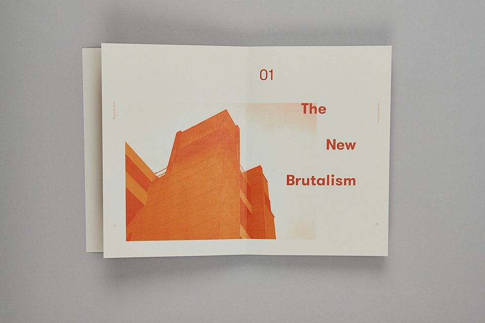
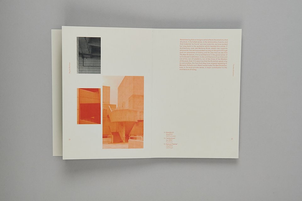
This book has been designed to accompany the Four Parts Sand / One Part Cement exhibition. The format of the book carries the rawness of concrete across to print, with grey stock, exposed binding and a book that’s been designed to symbolise a block. For consistency the branding and colour palette has been enforced on the book. The justified typographic layout within the book is designed to represent the bold structures within brutalism. Whilst the change in duo tone imagery relates to where the buildings are in the world, with orange representing the UK and black for the rest of the world.
Exhibition Design
Book Design
Best Student Book, British Book Design Awards 2015