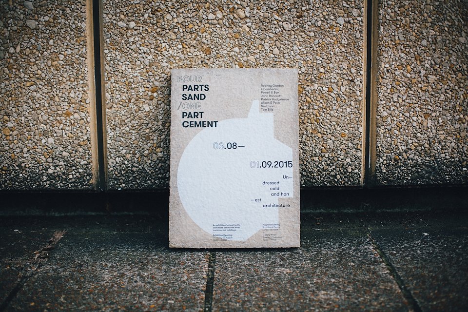
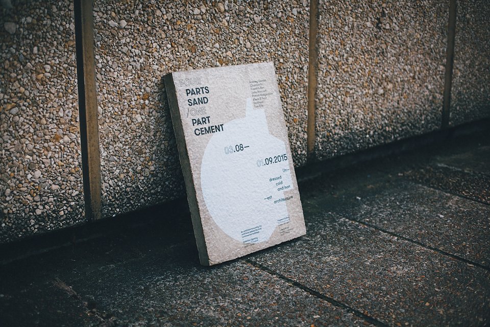
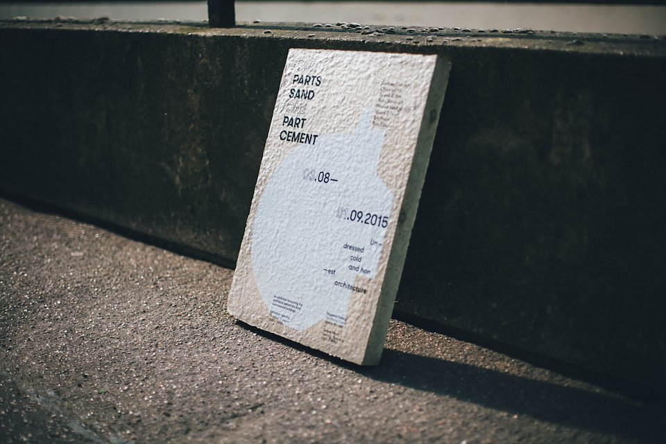
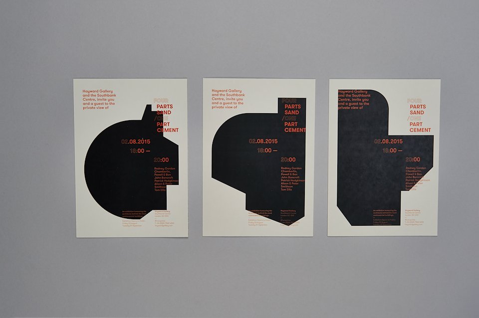
Four / One Exhibition
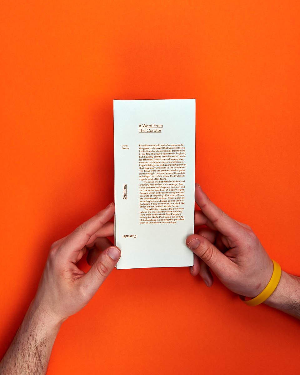
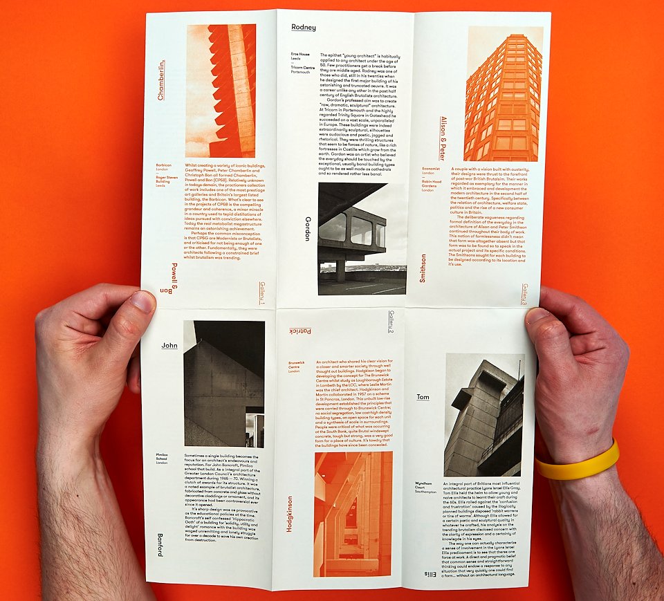
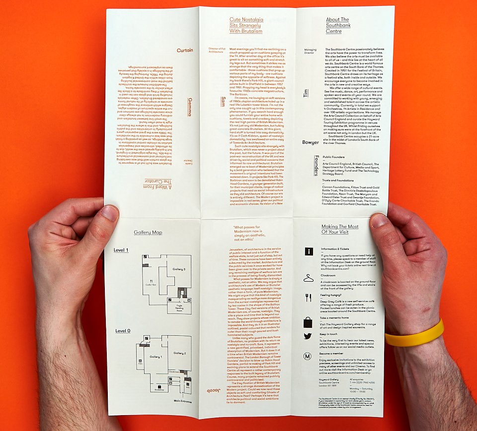
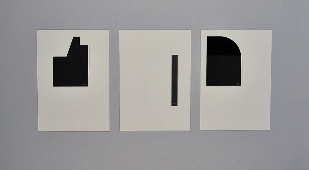
This is an exhibition that honors’ the architects behind the most controversial brutalist buildings. The name comes from the ratio required when making concrete. Whilst the visual language is formed through the use of vectors to symbolise the structures of the buildings. This refined approach portrays the true beauty of these buildings in a society that today perceives them as unattractive and unpleasant surroundings through the use
of interesting crops.
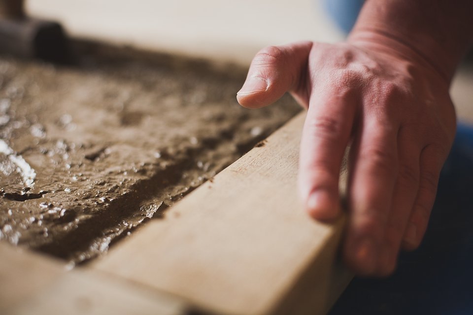
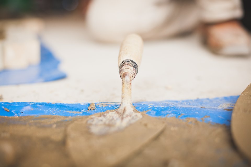
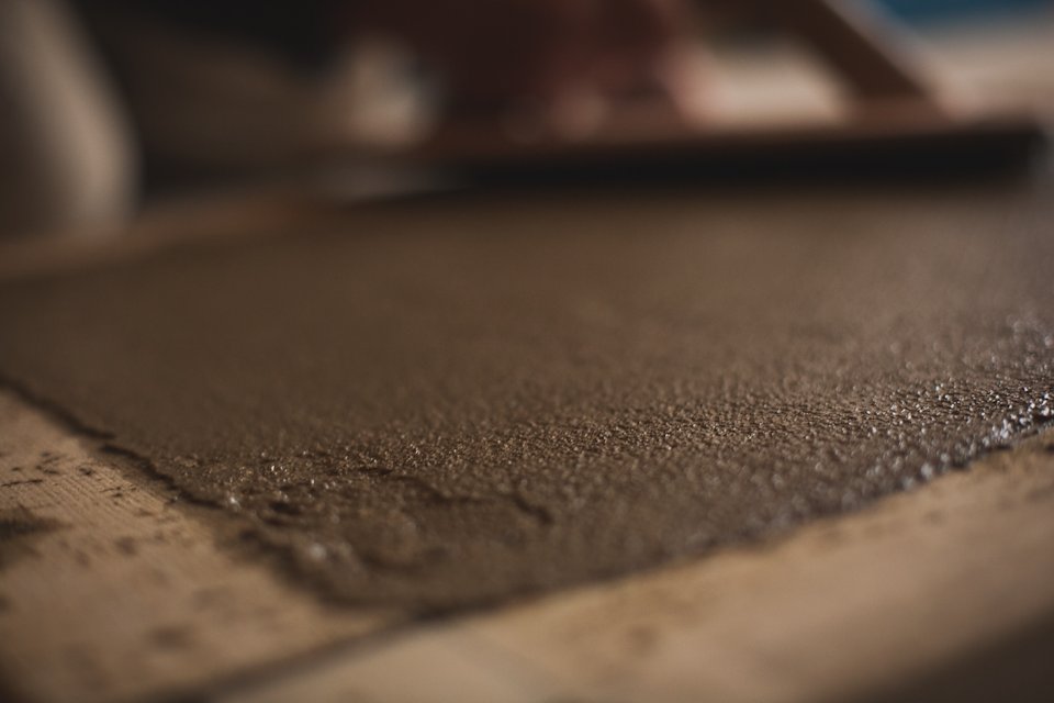
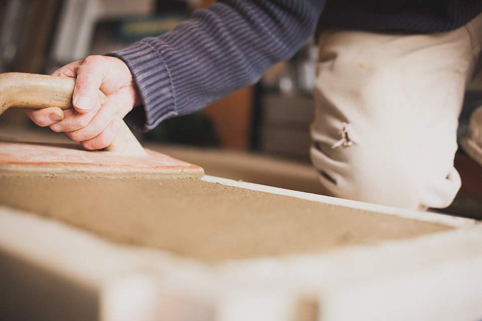
The poster refers back to brutalism at its purist form, concrete. Applying a vinyl print onto concrete displays how something so raw can be so beautiful.
The core idea is best implemented through the invite which entices the audience/user to help build and form the structure of each architects main building on arrival. Continuing the refined and minimal block structure across different outlets from the bold concrete poster design to the user scrolling through and selecting the shapes on a digital platform. In order to maintain the consistency between print and digital, the flyer uses the same contrasting alignment of vertical and horizontal names along with a restricted colour palette.


/background(fff)/960x540.jpeg?auto=webp)