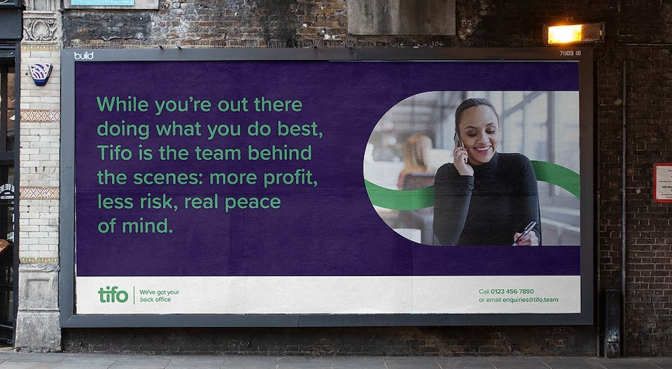
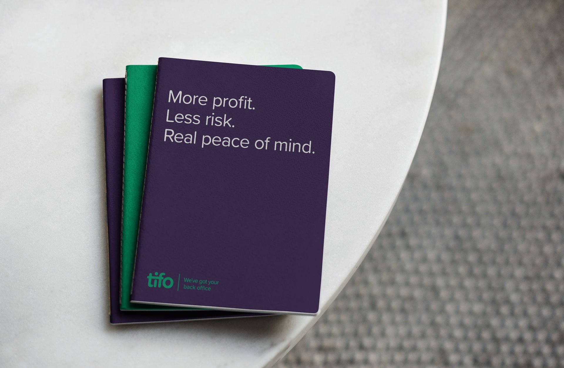
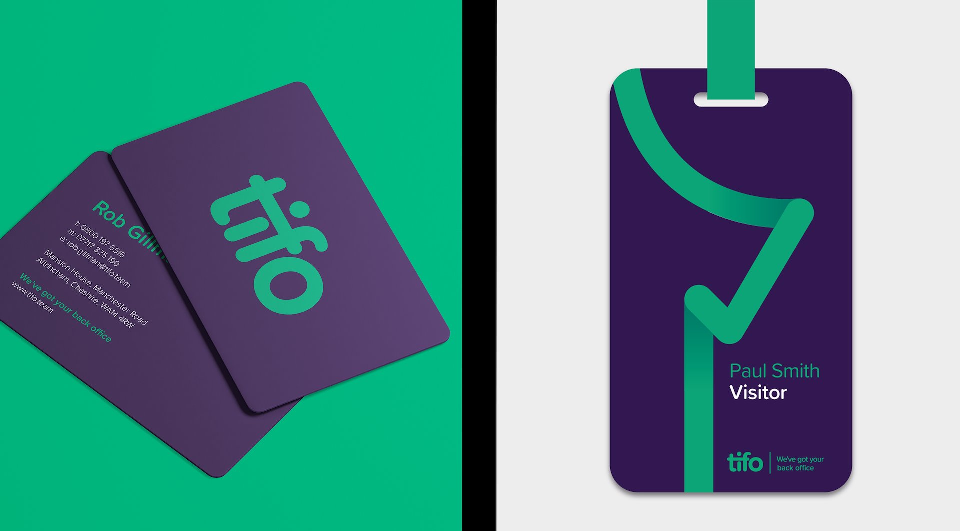
Tifo
Offering modular back-office services through a unique combination of cloud-based software and skilled people. The visual identity expresses the supportive, integrated nature of the service, as well as the friendly, caring personality. The ‘I’ is loosely figurative. The shared crossbar of the ‘t’ and ‘f’ suggests an arm around the shoulder, while the lower case logotype feels open and approachable. The arm is integral to the Tifo brand language; extending throughout, it extends throughout Tifo collateral acting as a symbol of support.
Branding, Print and Web Design
mark-making*

/background(fff)/960x540.jpeg?auto=webp)
/background(fff)/960x540.jpeg?auto=webp)
/background(fff)/960x527.jpeg?auto=webp)